
Mistakes in logo design can quietly undermine an otherwise great brand, and most beginners don’t spot them until it’s too late. Designing a logo can look simple from the outside. Choose a font, pick a color, add a symbol, and put everything together. Making a logo that truly works for a brand is much more than just making something that looks nice.
A logo is one of the most noticeable parts of a brand identity. It can show up on a website, a media profile, a business card, packaging, advertisements, signs, uniforms, and many other places. That means it has to look good not on a big screen but also when it is small, printed in one color, or placed on a completely different background.
This is where many new designers have trouble.
Some logo design mistakes may not be obvious when you first see a design. The logo might look clean and professional. Issues can show up when you think about how people will use and remember it.
Many parts, common symbols, hard to read text, extra effects and bad scaling can all make an otherwise nice design weaker.
If you are learning logo design. Making a logo for a new business knowing these common mistakes can save you a lot of time and help you make a better visual identity.
Trying to Put Everything Into the Logo
One of the common mistakes when designing a logo is looking at the logo as a small ad.
A new designer might start with the business name, add a symbol that shows what industry they are in, put in a phrase list the services they offer including the year the company was started and then try to put all of that into a single design.
This usually ends up looking too full.
A logo doesn’t have to tell people everything about the business. That’s what the website, the ads, the articles and other marketing stuff are for.
Think of a logo as an identifier. Its main job is to help people see and remember the brand.
For example a company that cleans homes doesn’t need to have a bucket, bubbles, a mop and a house in its logo. One distinctive visual idea may communicate the brand much more effectively.
Before adding something ask yourself: Does this make the brand more recognisable or am I simply adding information?
Choosing the Most Obvious Industry Symbol
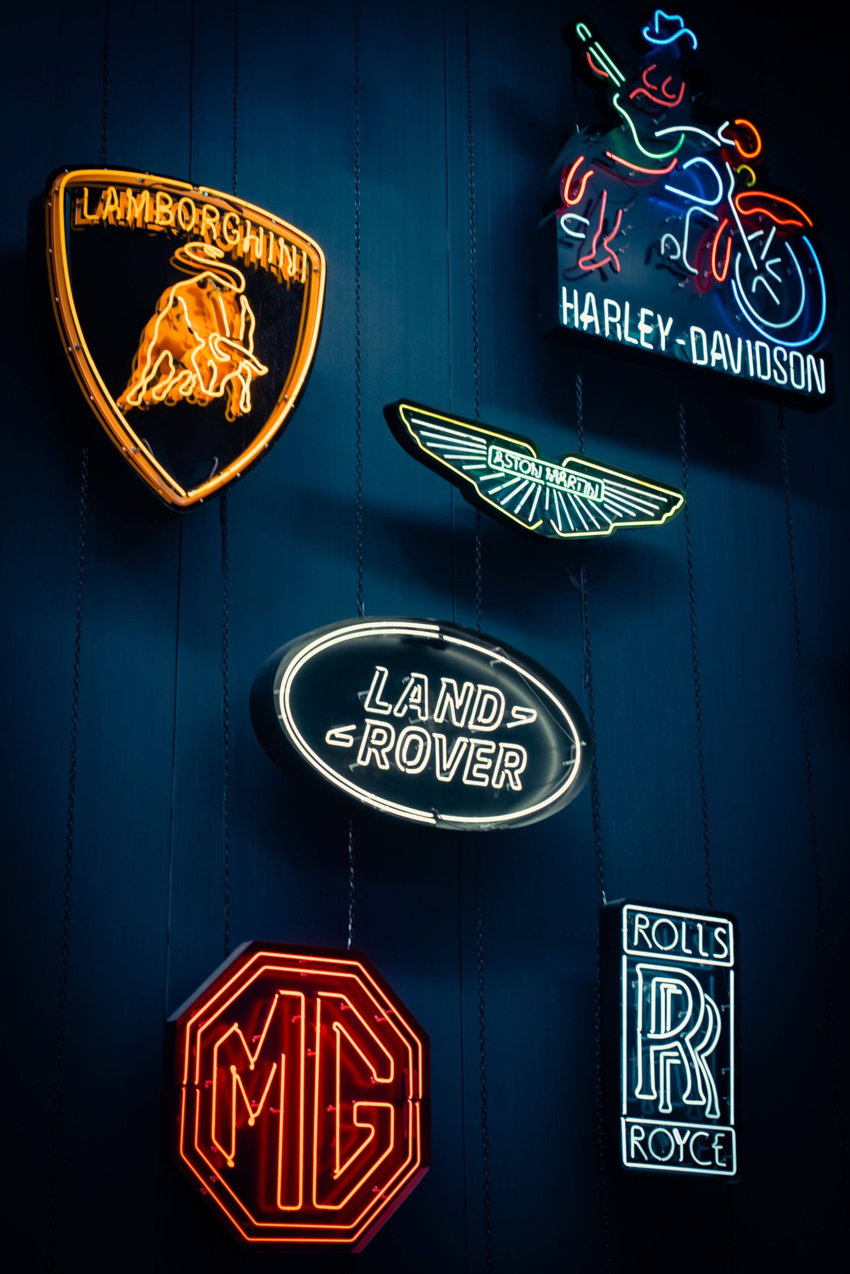
When creating something for a type of business the first thing that pops into your head is usually the most straightforward choice.
A dentist could end up with a tooth. A photographer could end up with a camera. A construction company could end up with a roof. An electrician could end up with a lightning bolt.
These images aren’t always bad. The issue is that many companies might already be using images.
A logo needs to help a brand be different, from brands not looking like everyone else.
This doesn’t mean you should never use an image. The key is how you choose to use it.
Before settling on your first idea, research competitors and ask:
- What symbols are they using?
- Which colors appear repeatedly?
- Are there visual patterns across the industry?
- How can this brand look different?
Your first idea should often become the “starting point for exploration” and the “starting point for exploration” is not necessarily the concept.
Forcing Company Initials Into the Design
Using initials can be a way to make a logo, especially for companies that have long names. Putting many letters into a complicated symbol can cause more issues than it fixes.
New designers often mix, turn, stretch, break and merge letters until the original initials are almost not clear anymore.
A smart logo, with initials can be easy to remember. Smart ideas should help the company’s image.
Ask yourself: Does this mix of letters make a look or am I putting them together just because the initials exist?
If people take a second to understand what the symbol stands for, the design might need to be simpler.
Adding Decorative Elements to Fill Empty Space
Empty space isn’t always a bad thing.
In fact using space well can make a logo look neater and more polished. New designers often look at a spot and think they need to put something in it like a curve, a circle, a line, a star, a swoosh or another fancy shape.
The issue isn’t whether the space feels empty. The issue is whether the shape serves a purpose.
Each shape should add something to the brand.
Try taking out a part of your design. If the logo becomes easier to understand and nothing important is lost you probably didn’t need it.
Sometimes the best choice, in design, is simply “taking something” .
Making Every Element Compete for Attention
A logo can have parts without being hard to understand. The real issue happens when everything in the logo wants to be seen at the time.
For instance the symbol is big, the company name is strong, the short message is bright and many colors are there. Several areas stand out a lot.
Where should someone look first?
Great logo design uses hierarchy. There needs to be a link between the main part and the other parts.
A good check is to look at your logo for two seconds and then turn away.
Ask yourself:
What do I remember?
If the answer is not clear the design might have many things fighting for attention.
Using Too Many Colors
I think color is powerful.. Having more color does not automatically mean that the design will be better.
I see beginners often use colors to separate the parts of a logo. One word may be blue another green the icon may contain shades and the tagline may have another color.
I notice that the logo can quickly become visually busy.
I believe a strong logo should work when color is removed.
I suggest trying to view the logo in black and white. This simple test allows you to focus on the shapes, typography, proportions, spacing and hierarchy.
I think if the logo works well in a color the logo has a strong foundation. Color can then be used to enhance the identity than hide weaknesses in the design.
Using Text That Becomes Unreadable
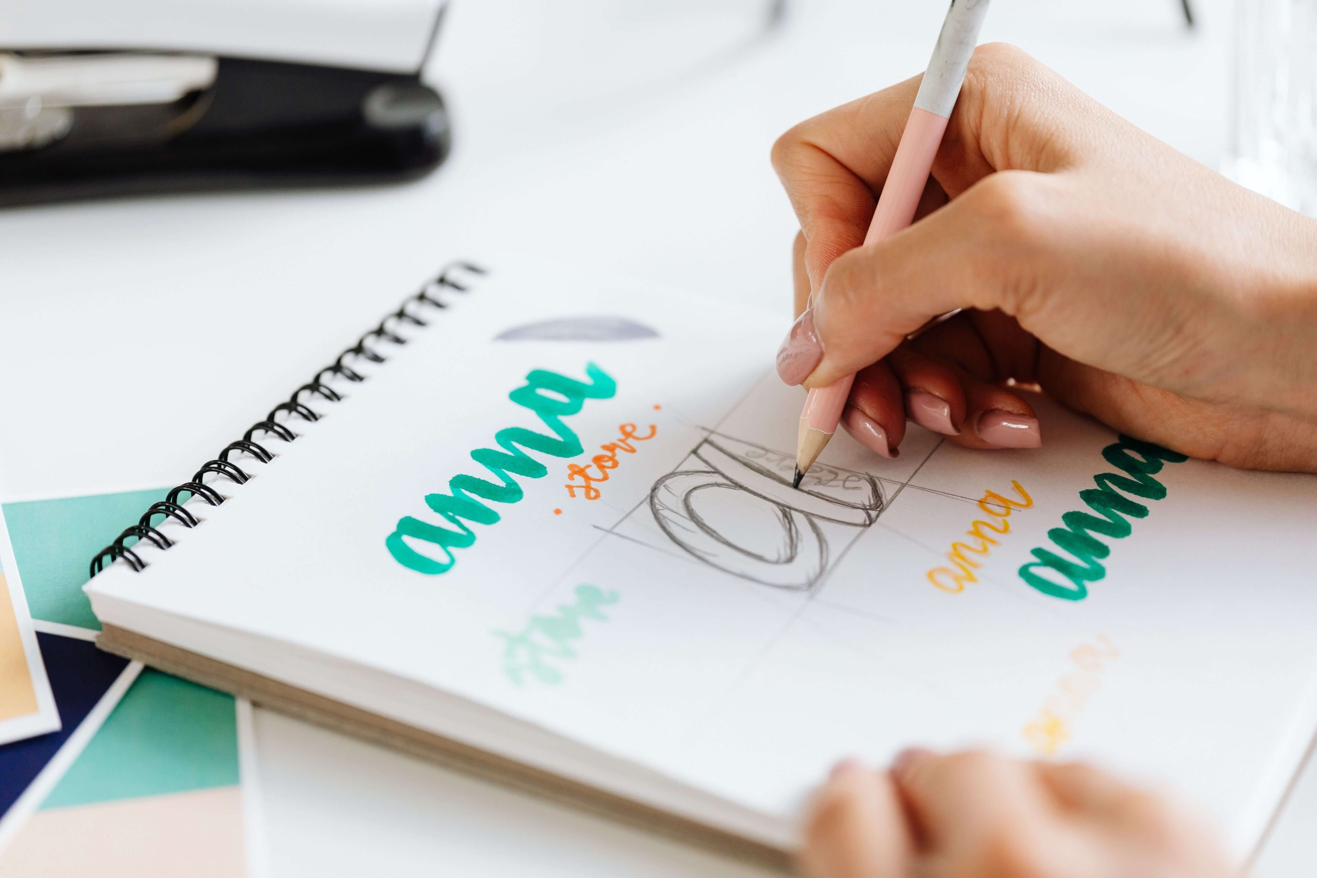
Taglines and descriptors can sometimes be useful especially when a business name does not clearly explain what the company does.
Beginners often set the supporting text small.
A tagline looks perfectly readable on a computer screen but when the same logo appears on a business card, mobile screen, social media profile or small printed item the situation changes.
The text may disappear completely.
If forcing one logo version to work everywhere consider creating different versions.
For example:
- A logo with the full name and tagline
- A simplified version without the tagline
- A compact version for spaces
- A symbol or monogram, for profile images and icons
Different versions make the identity more practical.
One of the Common Logo Design Mistakes: Creating a Logo That Is Too Wide
Some logos naturally work well in a horizontal layout. When a logo becomes too wide it can cause problems in today’s digital world.
Think about where logos appear
- Website headers
- Instagram profile images
- Mobile websites
- App icons
- Fav icons
- Business cards
- Digital advertisements
A logo that is very wide might look great on a desktop website header but it can become awkward or messy when placed inside a space. It might get cut off, look unbalanced or just not fit properly.
That’s why good logo design often starts with planning for uses. A horizontal version may be the logo but designers also create smaller versions—like a stacked layout, a simplified icon or a compact form—, for places where space is limited.
This way the logo stays clear and professional no matter where it appears.
Making the Symbol Bigger Than the Brand Name
A symbol can make a logo feel powerful and eye-catching.. There’s an important question to ask: Does the symbol overshadow the brand name?
When the symbol is too large it can distract from the name. The name is what people remember. It’s what helps them recognize the brand. If the symbol takes over the brand name might get lost.
A strong logo balances both elements. The symbol should support the name not compete with it. Sometimes a smaller cleaner symbol works better. It keeps the focus on the brand name while still giving the logo character.
Designers often test sizes and placements. They ask: Does this still work when small? Does it stay readable? Does the name still stand out?
Relying on Gradients, Shadows and Effects
Gradients, shadows, outlines, highlights and 3D effects can make a design look appealing on screen. They should not be used to cover up a weak idea.
Here’s a simple test: remove all the effects and turn the logo into a version with just one color.
Does it still work?
If the answer is yes then the core design is likely strong.
If the logo suddenly looks dull or hard to recognize the effects may have been doing most of the work.
There is also a side to consider. Logos often need to be used in different formats—embroidered, engraved, printed in black and white screen printed or made with very limited colors.
A good logo must stay clear and recognizable in all these situations.
Designing an Illustration of a Logo
An illustration and a logo do different things.
Illustrations can include scenes, multiple objects, shading, perspective and lots of visual details. A logo usually needs to get its message across clearly.
A common mistake beginners make is trying to show much in one logo.
For example, by using a simple symbol a designer might add a building, a vehicle, a landscape, tools, people and several other elements into one design.
It might look impressive when big. Try making it small—just a few centimeters.
Details start to disappear. Shapes blend together. The design becomes hard to understand.
That doesn’t mean illustrated logos are always wrong. The key is knowing how detail the logo can carry while staying easy to see and remember.
The goal is a logo that works in every situation— small, simple or complex.
Designing One Logo Version
Another common mistake is when people think that a brand only needs one fixed logo.
In reality logos are used in different situations.
A logo may need to appear on a background, dark background, square layout, horizontal layout, small screen, printed material or photograph.
A flexible identity can include:
- logo
- Horizontal version
- Stacked version
- Icon or symbol
- version
- White version
- Simplified small-size version
These are not completely different logos. Logo variations are variations of the visual identity designed for different applications.
Planning these variations early makes the brand easier to use
Not Testing the Logo at Small Sizes
This is one of the easiest mistakes of logo desinign to avoid.
Designers naturally work at a size because a larger size makes details easier to see.. Customers may encounter the final logo at a much smaller size.
Zoom out.
Make it tiny.
Look at it as a social media profile image or website icon.
At sizes a person may notice:
- Thin lines disappearing
- gaps closing
- Text becoming unreadable
- colours merging
- Detailed symbols turning into shapes
If the logo remains recognisable when it is small that is a good indication that the logo design is working.
Ignoring Negative Space and Proportions
Good logo design is not about the parts themselves; I notice that the space between those parts also matters.
I have seen that poor spacing can make a logo feel cramped. Much space can make the parts appear disconnected.
Pay attention to:
- Letter spacing
- Distance between the symbol and name
- Alignment
- Proportions
- Balance
- Empty space
I find that sometimes moving an element by a small amount can significantly improve the overall appearance.
Do not rush this stage because I have seen that refinement often happens through adjustments.
Choosing a Font Just Because It Looks Nice
I have seen that a font can completely change how a logo feels.
I think that a playful typeface may suit a children’s brand while a clean and professional typeface may be more suitable for a technology or consulting business.
The attractive font is not always the right font according to my experience.
I recommend considering the brand personality, target audience, industry, readability and long-term use, before choosing. Also avoid using many typefaces. In cases one strong typeface—or a carefully selected combination of two—will create a cleaner result.
A logo should not require someone to zoom in before a person can understand it.
Forgetting to Ask What Every Element Is Doing
Here’s one of the most useful questions a beginner can learn:
“Why is this here?”
Why is the circle there?
Why are these two words different colors?
Why does the icon need a shadow?
Why is the tagline included?
Why are the initials overlapping?
Every element should have a reason beyond “it looked empty without it.”
This mindset is one of the differences between simply decorating a logo and really designing a logo.
Good design is not about filling every space. Good design is about deciding which parts deserve to stay.
A Simple Test for Your Logo
Before finalising a logo run it through this checklist:
- Is it easy to recognise?
- Is the company name readable?
- Does it work in black and white?
- Does it work at a size?
- Can it work on both dark backgrounds?
- Is there a visual hierarchy?
- Does it look different from competitors?
- Can unnecessary elements be removed?
- Does it work in both compact formats?
- Does the logo still work without effects?
There is one question that I think is worth asking:
“Could this logo belong to several competitors in the same industry?”
If the answer is yes then the problem might not be about how the logo’s made. The idea itself may need attention.
Final Thoughts about mistakes in logo design
The “mistakes in logo design” often arise when people try to add too many things instead of choosing what can be left out.
A symbol is added to explain the industry. Another color is added to separate the text. A tagline is added to explain the service. A decorative line fills space. A gradient is added to make the design feel more exciting.
Each choice may look fine on its own. Together they can make the logo hard to recognise and even harder to remember.
A strong logo does not need to tell the story of a business. It only needs to create a visual sign that people can recognise and link to the brand over time.
If you are a beginner, pay attention to “simplicity, originality, readability, scalability and purpose”. Study the competition, test your designs at sizes, remove anything that is not needed and do not fear empty space.
The goal is not to create a logo that says everything.
The goal is to create a logo that people “remember”.